
Table of Contents
Are you struggling to present sales data in a way that makes sense for your organization?Salesforce dashboardscan help. The solution serves as an easier way to report, present, and share your Salesforce data.
Dashboards help you to get organized and make your life easy. They also help you to focus on what's important. This blog post will guide you through the basics ofSalesforce dashboardsand demonstrate how some simple tools can be combined to create powerful dashboards.
What is a Salesforce Dashboard?
ASalesforce dashboardis a collection of related reports, scorecards, and data visualizations viewed together in one place. They are created to give you an at-a-glance look at the big picture of your organization.
Dashboards are powerful tools within Salesforce that can track your sales performance, visualize KPIs, and more. They are helpful for business owners to evaluate the status, health, and performance of their organizations.
Salesforce dashboardscreate a more manageable process of information flow and deliver the vital metrics required to keep track of project development. So, what does it take to build a dashboard like this?
ASalesforce dashboardhas six core components: Reports, Visualization, Scorecards, Metrics, Pages Queries, and an Account Navigator. Each one plays a vital role.
Types of Salesforce Dashboards
Salesforce dashboardsare a powerful reporting tool for all levels ofSalesforceusers. They can monitor and analyze any aspect of your Salesforce data, from the top-level company-wide data to the individual record level.
There are two maintypes of dashboards in Salesforce:
1. Standard Dashboards
Standard dashboards are available to all users with access to reports and charts. They're great for getting an overview of your Salesforce data, but they don't have the same level of customization as custom dashboards.
2. Custom Dashboards
Custom dashboards are more flexible — they can be configured by users and made available to other users through sharing settings. This makes them ideal for use in teams or departments where you want everyone to access the same information.
There are many different types of Salesforce dashboards, each with its purpose and benefit. From executive to sales, each has its unique business function and is used to measure KPIs.
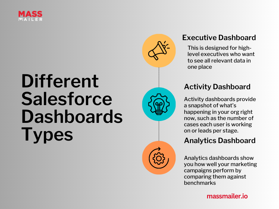
Salesforce Dashboards Types:
a. Executive Dashboard
This is designed for high-level executives who want to see all relevant data in one place. It's a great way to give critical stakeholders visibility into the health of your business.
b. Activity Dashboard
Activity dashboards provide a snapshot of what's happening in your org right now, such as the number of cases each user is working on or leads per stage.
c. Analytics Dashboard
Analytics dashboards show you how well your marketing campaigns perform by comparing them against benchmarks such as conversion rates or average order size.
Why Build a Salesforce Dashboard?
Salesforce dashboardsare a powerful tool for sales and marketing teams. They help teams track the performance of their business, monitor key metrics, and make informed decisions based on the data they display.
Dashboards are great for real-time monitoring KPIs, but they're even better when you can drill down into the details behind them. You can do this by clicking on any metric or graph on your dashboard for more detailed information about that specific data point. You can also use filters to narrow down your results only to show the relevant information.
The ability to filter and drill down into the data means that you don't have to spend time looking through your data points to find what you need. Instead, Salesforce will automatically present you with only the most relevant information according to your search criteria.
Your dashboard must tell a story about your business and its progress; it should show numbers and highlight any trends or changes so that it's easy to see what's going on with the business at any given time.
A goodSalesforce dashboardwill help you identify problems early on and provide solutions before they become too big or costly for your company. Such a dashboard should include historical information and current data points so you can compare them easily.
Salesforce Dashboard Best Practices
The first step in building aSalesforce dashboardis deciding what information you want to display. This might seem obvious, but it's essential to consider why you want the information displayed on your dashboard.
For example, if you're trying to measure the success of your marketing campaigns by tracking leads generated, your dashboard should include fields such as lead source and campaign name to compare metrics over time.
Once you've determined what data you need, choose the correct chart or graph type for your data and layout. Several types of graphs are available in Salesforce, including bar graphs (or bars), line graphs (or lines), pie charts, and more.
Each graph has its advantages and disadvantages depending on what type of information you're trying to convey — for example, if you want to show trends over time, bar graphs are ideal; however, if you want to compare two different sets of data at once (like sales revenue by region), line graphs might be better suited for your needs.
Next up: Select the suitable layout for yourSalesforce dashboard. Your layout will depend on how much space is available on your app home page and whether or not the content should be displayed full screen or within a page element such as a tabs component.
- Use multiple dashboards with different levels of detail. This can help you avoid overwhelming people with too much information at once while giving them access to everything they need. For example, you could have one dashboard that shows the most relevant metrics daily while another dashboard shows weekly metrics that managers can use during one-on-one meetings with their teams.
- Set up automatic email alerts so team members are alerted when specific metrics go above or below certain thresholds. This can be done quickly usingMassMailer. You can also use this process builder to create an email notification whenever someone creates a new record in a specific object (e.g., create an alert when new leads are created).
Shared or Unshared – Which is Right for You?
The first step in building aSalesforce dashboardis to decide whether you want your dashboard to be shared or unshared. Users with permission can only view an unshared dashboard, whereas anyone with access to the report can view a shared dashboard.
1. Shared Dashboards
Shared dashboards are ideal for teams collaborating on key metrics and KPIs. They're also helpful if multiple users across an organization need access to the same data.
For example, if you have several sales reps who work together on one deal, they'd benefit from having access to a sharedSalesforce dashboardto collaborate on their work.
2. Unshared Dashboards
An unshared dashboard gives you control over which users can see it. For example, if you want to share some key metrics but not others, then an unshared dashboard will give you more granular control over who sees what information on their dashboards.
If privacy isn't an issue, using an unsharedSalesforce dashboardcould save you time because it won't require additional setup steps or permissions configuration.
Components of a Salesforce Dashboard
Salesforce dashboardsare a crucial part of any customer-facing process. They make it easy for users to see the data they need and make it easy for you to see how your sales team is doing.
The differentdashboard componentswork together to present the most helpful information for your business. They include:
1. Dashboard Tiles
These are the building blocks of your dashboard. You can create dashboards by adding tiles from different tabs such as Home,Reportsand Analytics, and Opportunities.
Each tile represents a different visual representation, like graphs, tables, or charts. In addition to these standard tiles, there are custom tiles for advanced data visualization options such as maps and social media feeds.
2. Metrics
These are quantitative measures of performance that can be used to track progress toward goals or objectives. Metrics help you gauge how well you achieve your business goals and objectives.
For example, suppose your goal is to increase customer retention by 20% in one year. In that case, you might measure its effectiveness using metrics such as customer acquisition cost, customer churn rate, and customer lifetime value.
3. KPIs (Key Performance Indicators)
KPIs are metrics that help evaluate performance against key goals or objectives for some time (usually one quarter). They're often used to measure how successfully an organization has reached its goals during a specific period.
For example, if your goal is to increase customer retention by 20% in one year, use KPIs like CAC/LTV ratio.
4. Actions Menu
This menu allows users to take action from within the dashboard without leaving it open in their browser window or tab.
For example, if someone wanted to create a new lead record from within the dashboard, they could click on an action button labeled "Create Lead" at the top left corner of the page.
They would then have access to all necessary fields from within that same window or tab without losing access to other information being displayed on the page at that moment in time.
5. Dashboard Tabs and Cards
Dashboard tabs contain related sections of information, such as sales pipeline reports or customer satisfaction scores. They allow users to see multiple data sets simultaneously without switching between pages or tabs in their browser window.
Each tab includes a card that displays analytical charts about that particular topic area or department in your company (for example, sales pipeline performance by territory).
How Do You Customize Charts on Salesforce Dashboards?
Salesforce provides a drag-and-drop interface for creating custom dashboards, so it's easy to change the layout or customize individual charts. To create a new dashboard:
- Click on the "New" button at the top right corner of your Home tab.
- Enter a name for your dashboard in the "Name" field and click "Create."
Now you can start adding charts! Click on any chart icon in your list of dashboards to open up its customization options.
To customize a chart, click on it and then select "Edit Chart." You'll see a new window with an assortment of tools that let you change various aspects of your chart's appearance. There are six tabs within the Edit Chart window:
- Data — Allows you to change the data source or remove it altogether.
- Chart Type — It lets you choose from several charts, such as line or pie charts, etc.
- Axis — Allows you to edit the title of each axis and change their ranges (e.g., for percentages or numbers).
- Label — This lets you rename each axis label (e.g., "Total Sales" instead of "$").
- Legend — Gives you control over which fields show up in each legend item (e.g., "Region" instead).
Wrapping Up
Getting insight into your sales data is beneficial, but just a dashboard isn't enough. With a little extra work, you can really improve the value of your Salesforce Dashboards.
For starters, you can useMassMaileras a marketing tool to send bulk emails at scale or to run email campaigns quickly and easily. To try it out, sign up for a 15-day free trial and start improving customer engagement today!
Start Your Free Trial Today
Experience MassMailer the easiest way to send personalized emails from Salesforce.
Related Blogs
MassMailer Resources


MassMailer Glossary
About the Author

Siva Devaki 
Siva Devaki is the founder of MassMailer Inc., a tool that helps Salesforce users optimize email marketing. A passionate advocate for email marketing, Siva writes and hosts podcasts on the topic, sharing insights to help businesses drive revenue and enhance customer engagement through Salesforce email automation and tracking.