

Table of Contents
Introduction
A Salesforce dashboard turns data into a story. Instead of scrolling through endless reports, you can see your entire business performance on one screen. Each chart or metric shows what is working, what needs attention, and where your team can improve.
If you want to build a Salesforce dashboard that highlights the right metrics and drives decisions, you are in the right place. Dashboards should make data easy to understand and act on, not just look visually appealing.
Still, many dashboards fall short. They often include too many metrics, unclear goals, or visuals that confuse instead of clarify. The result is information overload instead of insight.
The good news is that building a meaningful Salesforce dashboard does not require advanced technical skills. It requires a clear plan, thoughtful design, and the right integrations. In this guide, I will show you how to plan, create, and customise dashboards that make reporting effortless.
Let’s start with the basics: what a Salesforce dashboard is and why it matters.
What is a Salesforce dashboard, and why use it
A Salesforce dashboard is a visual reporting tool that turns your Salesforce data into charts, graphs, and key metrics. It gives you a real-time view of performance across sales, marketing, and customer teams.
Each dashboard pulls information from one or more reports, helping you track progress, measure KPIs, and identify trends without opening multiple spreadsheets or tabs.
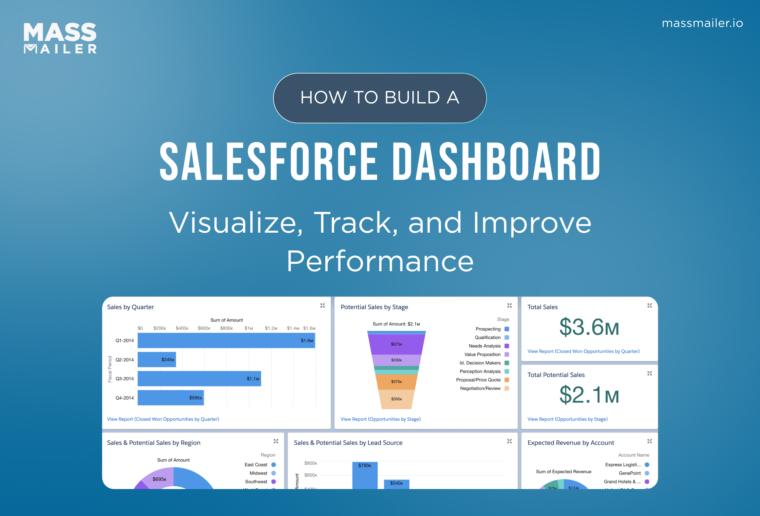
When you build a Salesforce dashboard, you combine different components, such as gauges, funnels, tables, and charts, to create a clear picture of business performance. You can also create a custom Salesforce dashboard that focuses on your team’s most important metrics, such as lead conversions, campaign ROI, or email engagement.
Dashboards in Salesforce are often used for sales performance, marketing analytics, and service operations, making them a practical way to share insights across departments. They work best when they focus on a few meaningful goals instead of every metric available.
According to Salesforce Trailhead, effective dashboards make decision-making faster, reduce manual reporting, and help you measure real outcomes. In short, a well-built Salesforce analytics dashboard turns data into action.
How to plan your Salesforce dashboard effectively
Before you build a Salesforce dashboard, take a few minutes to plan what you want it to show. A clear plan helps you avoid clutter and ensures your dashboard tells a useful story, not just displays data.
Define goals and metrics
Start with a simple question: What do I want this dashboard to answer? For example, do you want to track lead conversion, campaign ROI, or customer response time?
Once you know the goal, list the key performance indicators (KPIs) that measure success. For a marketing dashboard, this could include email open rate, click-through rate, and campaign revenue.
For sales, it could be opportunity value, win rate, and average deal size. Keep the list short and relevant. Three to five metrics per dashboard work best.
Identify your data sources
Each component of a dashboard pulls data from a report. Review your Salesforce reports to make sure they include accurate filters, time frames, and data fields. If you use tools like MassMailer, connect those metrics too.
For example, integrating MassMailer’s email tracking data lets you see campaign engagement directly inside your Salesforce analytics dashboard, so you can compare message performance with lead quality in one view.
Pick dashboard components and visuals
Choose the right chart or visual for each metric:
- Use bar charts to compare regions or reps.
- Use gauges to show progress toward a goal.
- Use funnels to track stage-by-stage conversions.
- Use tables for detailed views.
Keep visuals clean and labels clear. Avoid overloading the layout with too many components.
Set access and permissions
Decide who will view and edit the dashboard. In Salesforce, you can create a custom Salesforce dashboard that shows data only relevant to each user’s role. Setting permissions keeps your data secure and ensures each viewer sees accurate insights.
A well-planned dashboard saves hours of manual reporting and helps teams focus on what truly moves the needle.
How to build a Salesforce dashboard step by step
Building a Salesforce dashboard is where planning turns into action. Every choice you make, from selecting reports to designing visuals, determines how useful your dashboard will be. Here’s a step-by-step process to help you create a dashboard that is accurate, actionable, and easy to maintain.
1. Start from the dashboards tab
Go to the Dashboards tab in Salesforce and click New Dashboard. Enter a clear name, add a short description, and select the right folder.
- The Private folder is best for dashboards you are still testing or building.
- The Public folder lets everyone in your organization access the dashboard.
- The Custom folder limits visibility to specific teams or roles.
Choosing the correct folder ensures only the right users can view or modify the dashboard. Set a running user, which determines what data others can see. For shared dashboards, choose a running user with higher access privileges so everyone sees consistent results.
2. Build or verify the underlying reports
Each dashboard component depends on one or more Salesforce reports, so accuracy starts there. Review or create reports that match your goals.
- Make sure you select the correct report type, such as Opportunities, Leads, or Campaigns.
- Always use appropriate filters and date ranges so the data reflects your target period, like this quarter or the last 90 days.
- Format your reports as summary or matrix reports, since dashboards cannot use plain tabular reports without row limits.
- Group the data logically, such as by owner, region, stage, or product line, to make the visuals meaningful.
- Use formula fields when needed to calculate KPIs like win rate, conversion rate, or average deal size.
Tip: Review your reports before adding them to dashboards. If the filters or groupings are incorrect, the dashboard will not display properly.
If you are tracking campaigns or email performance, integrate MassMailer reports. This allows you to view open rates, click rates, and bounce data directly in your Salesforce reporting dashboard, giving you one consolidated view of campaign success and lead engagement.
3. Add and customise dashboard components
After selecting the data source, click +Component to add visuals to your dashboard.
- Use bar or column charts to compare categories such as regions or sales reps.
- Use pie or donut charts to show proportions, such as lead sources or campaign performance.
- Use funnel charts to show how opportunities move through stages.
- Use gauge charts to track progress against specific goals.
- Use tables or lightning tables to list detailed data with links to individual records.
Keep your layout clean and consistent. Use short titles, clear labels, and consistent colors across all components. Group related visuals together, such as sales metrics on one row and marketing data below it, to make the dashboard easier to scan.
4. Configure filters and dynamic views
Dashboard filters make it easier for users to personalize what they see. You can add up to three filters to a single dashboard.
- Add region filters to view data for specific geographies.
- Add time filters to compare monthly, quarterly, or yearly performance.
- Add product or campaign filters to analyze specific categories.
Ensure that all reports use consistent field names so filters apply correctly. You can also enable dynamic dashboards so that the displayed data changes automatically based on the viewer’s role or access level. This approach allows managers and team members to view relevant metrics without creating duplicate dashboards.
5. Save, refresh, and schedule automatic updates
Once you finish customizing your visuals, click Save and Done. Keeping your data current is essential for accuracy.
- Schedule dashboard refreshes daily for sales and campaign metrics that change frequently.
- Refresh hourly for dashboards that track fast-moving KPIs or live campaigns.
- Turn on email notifications so the latest dashboard snapshot is sent automatically to key stakeholders.
- Review scheduled refresh settings regularly to make sure data loads efficiently.
- Include MassMailer performance snapshots in your reports to connect email engagement data with pipeline performance automatically.
A well-built Salesforce analytics dashboard combines accurate data, thoughtful visuals, and automatic updates. When built with intention, it becomes your team’s most reliable source for tracking progress and making fast, data-driven decisions.
How to customize a Salesforce dashboard
Once your salesforce dashboard is built, the next step is to make it truly useful for your team. Customizing your Salesforce dashboard helps you present the right information to the right people in the clearest way possible.
Here is how to customise a dashboard for better clarity, usability, and impact.
1. Choose the right dashboard layout
The layout determines how your data looks and feels. Salesforce offers flexible layouts that you can adapt to your needs.
- Arrange components in logical rows so that users can scan from top to bottom easily.
- Place the most important metrics, such as revenue or conversion rate, at the top.
- Keep supporting charts like regional breakdowns or campaign details below.
- Use consistent chart sizes to create visual balance.
- Leave enough white space between components so the dashboard looks clean and readable.
A well-structured layout guides attention and reduces visual noise.
2. Apply dashboard filters effectively
Filters let users personalize the view without editing the dashboard.
- Add filters for date ranges, regions, or product lines so viewers can adjust results in real time.
- Keep the number of filters limited to maintain performance.
- Use consistent field names across reports to ensure the filters work correctly.
- Test filters after applying them to make sure each one returns accurate results.
- Provide clear labels so users understand what each filter changes.
Filters make a custom Salesforce dashboard interactive and user-friendly.
3. Enable dynamic dashboards
Dynamic dashboards show data based on who is viewing them.
- Assign the running user as “Run as logged-in user” to activate dynamic views.
- Verify that each viewer has the correct permissions for the underlying data.
- Use dynamic dashboards to avoid creating separate dashboards for every team.
- Review sharing settings to prevent data from being visible to the wrong audience.
- Limit dynamic dashboards to high-priority use cases to control system resources.
Dynamic dashboards make Salesforce more engaging by showing each user personalized, role-based insights that help them focus on the data most relevant to their goals.
4. Refine visuals and formatting
Visual polish matters for readability.
- Adjust colors to align with your company’s branding or use Salesforce’s default palette for consistency.
- Simplify chart labels to make key takeaways clear.
- Rename components with descriptive titles such as “Monthly revenue trend” or “Lead conversion by source.”
- Use contrasting colors to highlight positive and negative trends.
- Preview your dashboard in both desktop and mobile modes to ensure a responsive design.
A well-customised Salesforce analytics dashboard communicates insights at a glance, helping teams act quickly on what they see.
How to interpret Salesforce dashboard results
Building a salesforce dashboard is only half the job. The real value comes from understanding what your charts and numbers actually mean. A good Salesforce dashboard should tell a story: what happened, why it happened, and what to do next.
Start by reviewing key performance indicators (KPIs) that align with your goals. For sales, that might include win rate, opportunity stage, or revenue growth. For marketing, focus on campaign ROI, conversion rate, and engagement metrics. Always compare current performance against targets or previous periods to spot meaningful trends.
Next, look for patterns and relationships between metrics. For instance, if your lead volume increases but the conversion rate drops, it might mean your outreach is broad but not targeted. That insight helps you adjust your strategy before it affects revenue.
Use filters in your Salesforce analytics dashboard to dig deeper. Switch views by team, product, or region to find what drives results. Dynamic dashboards make this easier by automatically adjusting the data based on who’s viewing it.
Finally, focus on actionable takeaways. Every metric should prompt a question or decision, whether to follow up with inactive leads, increase campaign spend, or refine email timing.
Your dashboard is not just a report. It is a feedback loop that turns data into insight and insight into action.
How to fix common Salesforce dashboard issues
Even the best dashboards can occasionally display errors or missing data. These issues usually come from outdated reports, missing permissions, or incorrect filters. The good news is that most problems are easy to resolve when you know what to check.
1. Dashboard not showing data
- Confirm that the source reports contain data and use the correct filters.
- Make sure the report type includes all records relevant to your dashboard goals.
- Verify that the running user has access to the data displayed in those reports.
- Adjust the report filters to include the right date range, such as “this month” or “this quarter.”
- Check that the dashboard is not using a tabular report without a row limit, because those cannot be displayed in dashboards.
2. Dashboard components not refreshing
- Open the dashboard settings and confirm that the refresh schedule is active.
- Ensure that the underlying reports are updated before the dashboard loads.
- Verify that your user permissions include access to schedule or refresh dashboards.
- Avoid setting refresh intervals that are too frequent, since this can slow performance.
- Use email notifications or snapshots to receive regular updates automatically.
3. Inconsistent or missing filters
- Check that filter field names match across all reports used in the dashboard.
- Remove duplicate filters that apply the same condition.
- Test each filter individually to confirm that it returns the correct data.
- Keep the number of filters limited to maintain speed and clarity.
- Save and refresh the dashboard after every filter adjustment to apply changes.
4. Slow or unresponsive dashboards
- Limit the number of components on a single dashboard to improve load time.
- Use summary or matrix reports instead of detailed data-heavy ones.
- Simplify formulas and remove unused calculated fields from reports.
- Archive or exclude old data that no longer needs to appear in dashboards.
- Choose simple visuals, such as bar or gauge charts, to improve rendering speed.
Fixing these Salesforce dashboard issues keeps your data reliable and your visuals clear. A responsive, accurate Salesforce reporting dashboard helps your team stay focused on insights that matter.
Salesforce dashboard best practices
A well-designed Salesforce dashboard does more than display data. It helps teams understand performance, identify challenges, and make faster, data-driven decisions. To keep your dashboards useful, accurate, and actionable, follow these proven best practices.
Define the purpose before you design
Every dashboard should begin with a clear goal. Ask yourself what question the dashboard needs to answer. If it is for sales, focus on metrics like revenue growth, win rate, and pipeline health. If it is for marketing, highlight campaign ROI, conversion rate, and engagement.
When you define purpose first, you avoid adding unnecessary components. A focused dashboard is easier to read and delivers meaningful insights that actually drive action.
Keep visuals consistent and simple
Consistency builds clarity. Use the same chart types, fonts, and color schemes throughout your Salesforce analytics dashboard so users can compare data easily. Salesforce’s Lightning Experience allows you to align charts and resize them for a balanced layout.
Simplicity is equally important. Too many visuals make dashboards harder to interpret. The best custom Salesforce dashboards display only a handful of key metrics, usually between five and ten, that matter most to the team. If a chart doesn’t serve a purpose, remove it.
Refresh your data regularly
Dashboards lose their value when the data becomes outdated. Review your Salesforce reporting dashboard schedule to make sure refresh intervals match your workflow. Daily updates work best for sales and campaign dashboards, while leadership summaries may need only weekly updates.
Set up scheduled refreshes or email snapshots so teams always see the latest numbers. Regular updates save time and improve trust in the data.
Control access and permissions
Access control keeps dashboards secure and reliable. Limit editing rights to team members who understand how the data is structured. Give others view-only access so they can monitor results without changing components.
This approach prevents accidental edits and ensures everyone sees the same version of the truth. It also helps you maintain data integrity across departments.
Encourage collaboration and discussion
Dashboards work best when they become part of team conversations. Use them in sales meetings, campaign reviews, or customer success check-ins. Encourage team members to discuss what the data means and what actions to take next.
Dashboards should inspire immediate action, not passive observation. Every metric should spark a question or prompt a decision, whether it is refining a campaign, following up with a lead, or celebrating a win.
A well-maintained Salesforce dashboard turns static data into practical insight. When you follow these best practices, your dashboards stay relevant, accurate, and actionable, helping every team make smarter, faster decisions.
Advanced Salesforce dashboards and integrations
Advanced Salesforce dashboards connect data, automate updates, and integrate tools like MassMailer to deliver real-time performance insights. These dashboards transform reporting into an intelligent decision system that links marketing, sales, and engagement data.
Connect external data
Start by integrating data from other systems using Salesforce Connect, APIs, or external objects. You can bring information from marketing, finance, or tools like MassMailer directly into Salesforce. Map external fields correctly, for instance, align Email Opens from MassMailer to the Campaign Member object to track engagement within campaigns.
Use incremental refresh to update new data without slowing the system. Apply the same data-governance rules across all sources to maintain accuracy. For a complete funnel view, combine CRM data with analytics tools such as Google Analytics, as demonstrated in Geckoboard’s Salesforce dashboard example.
Automate alerts and refreshes
After connecting data, set up automation to keep dashboards current. Schedule dashboard refreshes and enable subscriptions so users receive updates by email. Create notification rules to alert teams when KPIs fall below or rise above targets. Tools like Salesforce Flow or Process Builder can trigger refreshes automatically after data imports or campaign completions.
Monitoring refresh logs ensures your dashboards always display accurate, live data.
Enhance reporting with MassMailer
With MassMailer integration, you can import email metrics like opens, clicks, and bounces into Salesforce. Build reports showing open rate by campaign or click-through by segment, and display them beside CRM outcomes such as leads or opportunities.
This setup gives teams and executives a unified view of campaign ROI and engagement. Providing short guides or training helps users interpret these insights with confidence.
Use dashboards on mobile
Enable Lightning Dashboards for mobile and test layouts on iOS and Android. Use responsive design, highlight top KPIs, and simplify visuals for smaller screens. Allow users to subscribe to push notifications about key updates, and review mobile performance analytics regularly.
Advanced Salesforce dashboard integrations unify automation, analytics, and engagement. When you connect MassMailer and optimize automation, your dashboards move from static reports to dynamic insights that drive real business impact.
Conclusion
Building a Salesforce dashboard is not just about tracking numbers. It’s about seeing the full story behind your data, how sales, marketing, and email engagement connect to drive real growth. When dashboards are set up correctly, they become more than reports; they become the foundation for better, faster decisions.
The key takeaways are simple. Start with clean, connected data. Automate updates so your dashboards stay accurate. Integrate tools like MassMailer to track email opens, clicks, and ROI directly within Salesforce. Finally, keep dashboards accessible across desktop and mobile so insights reach every decision-maker.
If you’re ready to enhance your Salesforce reporting dashboard with real-time email-performance data, MassMailer can help. Its seamless integration with Salesforce lets you visualize engagement, measure campaign success, and turn data into action.
Try MassMailer for Salesforce and see how effortless dashboard-based insights can transform the way your team measures success.
Frequently Asked Questions
1. How do I share a Salesforce dashboard securely with my team?
2. What is the difference between a Salesforce report and a dashboard?
3. Can I create custom dashboard templates in Salesforce?
4. How can I fix “insufficient privileges” errors when viewing a dashboard?
5. What limits should I know before customizing dashboards?
6. How can MassMailer improve Salesforce dashboard analytic
Start Your Free Trial Today
Experience MassMailer the easiest way to send personalized emails from Salesforce.
Related Blogs
Salesforce Email Marketing Tool Comparison: Native vs Integrated Tools
Salesforce Platform Overview: How It Works and When It Fits
Salesforce Sales Email Best Practices That Drive Results
MassMailer Resources


MassMailer Glossary
About the Author

Siva Devaki 
Siva Devaki is the founder of MassMailer Inc., a tool that helps Salesforce users optimize email marketing. A passionate advocate for email marketing, Siva writes and hosts podcasts on the topic, sharing insights to help businesses drive revenue and enhance customer engagement through Salesforce email automation and tracking.